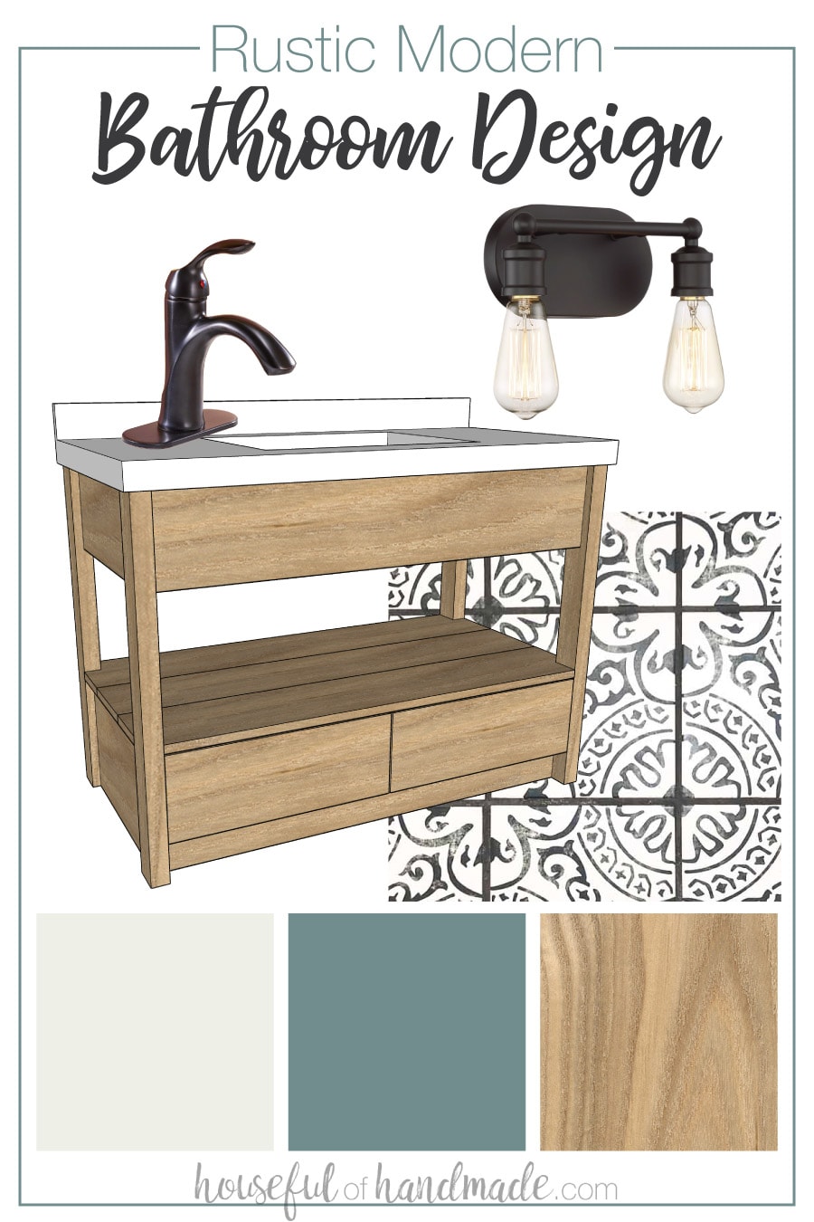
Give your guest bathroom a fresh new look with a warm, rustic modern design.
Why is it that the most used bathroom in our house, especially by guests, is the last one to get remodeled? To say I was embarrassed by the old bathroom would be an understatement.
Our main bathroom has not seen any updates since we moved into the house aside from a new shower curtain. The entire room was still in it’s worn down 80s glory.
So before I share the beautiful new rustic modern bathroom design, I first need to share the before pictures. And would you believe it is very difficult to post these on the internet for everyone to see. Its hard to believe we dealt with it like this for so long.
This post may contain affiliate links. As an Amazon Associate I earn from qualifying purchases. Click here to read my full disclosure policy.
Guest Bathroom Before
Our guest bathroom is also technically the bathroom for the upstairs bedroom. This room was the children’s before we moved them both to the basement bedrooms and I turned it into the perfect office and craft room for only $100.
It is a small bathroom, only 5′ x 6 1/2′ minus the standard tub. So making the room feel bright and open is a must.
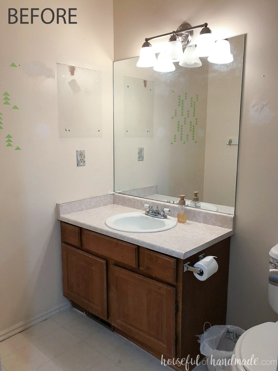
As you can see the vanity was a standard builder grade vanity. But what you may not notice, is the complete lack of usable storage.
There are only 2 tiny (and by tiny I mean 4″ wide) drawers on either side of the vanity. These drawer barely hold a tooth brush and hair brush. So all the storage is the open area below. Not easy to organize or very user friendly!

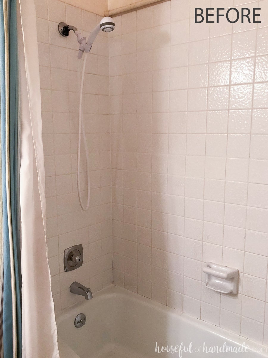
On the other side of the bathroom is the shower/tub combo. The tiles in the bathroom were loose and ready to fall out. But we needed to extend their life another year or two, so I sealed them back into place with some adhesive caulk. It actually made the bathroom look quite nice for a minute.
However, these tiles are textures and hard to clean. They are definitely showing their age! I can’t wait to replace them with some clean, modern tiles.
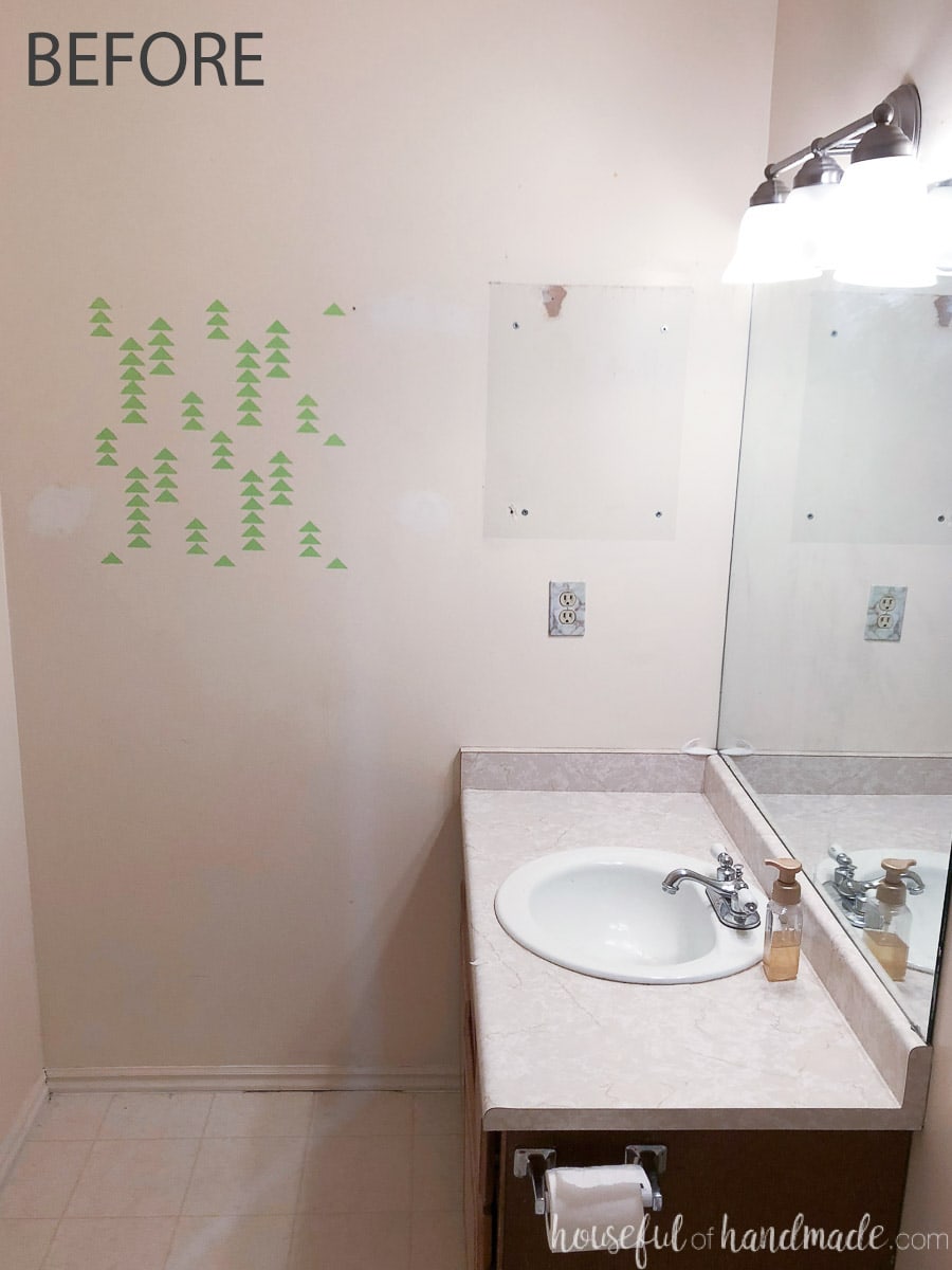
Let’s not forget to mention the rest of the awful things about this before bathroom… like the 80s linoleum floor, not quite white wall paint, aged counter top, terrible lighting, and that spot on the wall I used to test out a stencil. All of this is going goodbye!
Modern Rustic Bathroom Design
What is the plan to take this 80s builder grade bathroom into the new century? And not only modern, but with rustic flair and lots of style?
New Flooring:
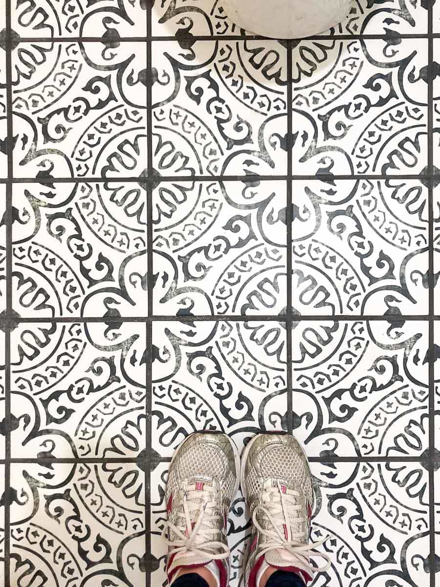
When remodeling a small bathroom, splurging on things like flooring can make a huge impact. The total cost difference for a small space is nominal when you use a fun tile.
We already installed the new flooring and it gave this room an instant facelift! I chose a patterned tile to give the room some pizzaz. Again, this bolder tile is great for small spaces because it doesn’t overwhelm the room.
New Paint Colors:
We are saying goodbye to the no-quite-white walls and ceiling for a fresh coat of a beautiful white on the walls. And for the ceiling, we are going bold!
Again, a guest bathroom is a great place to try something bold and different. So instead of the standard white ceiling we are going to paint ours a grayish turquoise from Behr called Tasmanian Sea. Thanks to Behr for partnering with us for these fun new paint colors.
New Vanity:
I couldn’t have been more excited to remove the old vanity! It was literally falling apart on the inside.
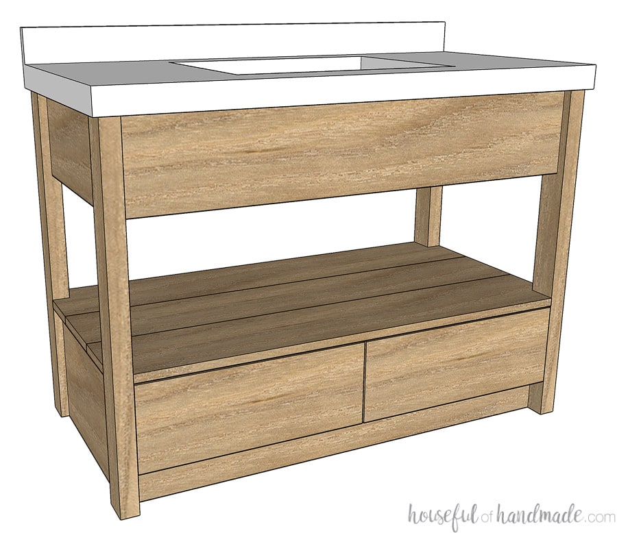
After building the mission style open shelf bathroom vanity for our master bathroom, I knew I could tackle this smaller bathroom vanity too! I am currently in the middle of building it and will have plans ready to share very soon!
The new vanity will have a modern style with drawers on the bottom. These drawers will be MUCH bigger than the original vanity to store lots of stuff. And there will be open shelves.
I love open vanity shelves for a guest bathroom. Everything your guests need is out in the open so they don’t feel weird about having to open the drawers and snoop.
New Fixtures:
The lighting, faucet, towel bars, etc. are all going! And to help tie in the darker tones on the floor and give the white walled bathroom some warmth, I am going for oil-rubbed bronze.
Adding in dark elements to a room really helps to ground it and create visual depth. The bathroom fixtures is a great way to add dark to a small bathroom without making it feel any smaller.
New Shower Tile:
To keep our budget in check and give the shower a timeless look, we are using white porcelain subway tiles in the shower. I love the way it turned out in our master bathroom.
New Bathroom Decor:
Of course, the rest of the bathroom will get an update too. I will get to shop for a new shower curtain and add some art and decor to the guest bathroom. Art is often forgotten about in a bathroom but really makes the room special.
So that is the plan, and we are already working hard to get things done! I cannot wait to share the different parts of this bathroom as it comes together. But even more excited to not cringe when guest come over and ask where the bathroom is!
